Dairy · Sudan · 2023
Purity Farm
A whole dairy range under one packaging system — recognisable from the first bottle to the last yogurt cup.
One range,
one structure.
Challenge
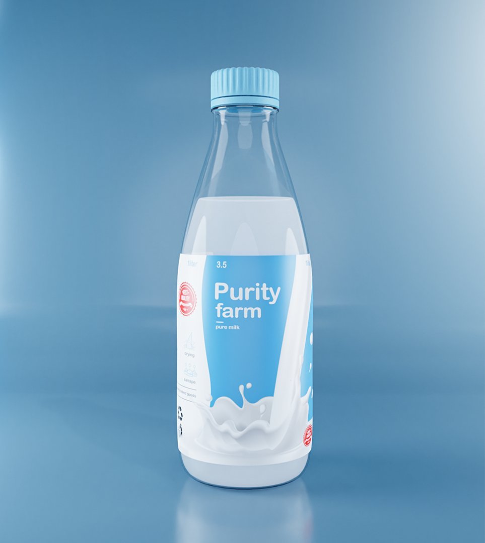
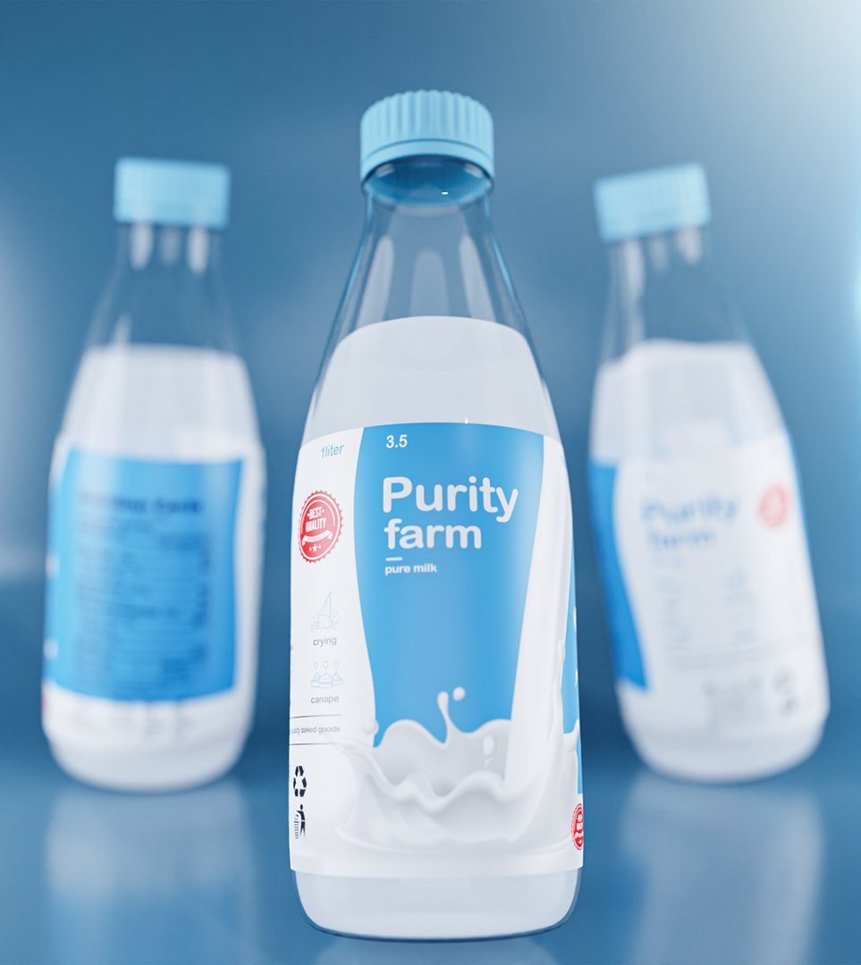
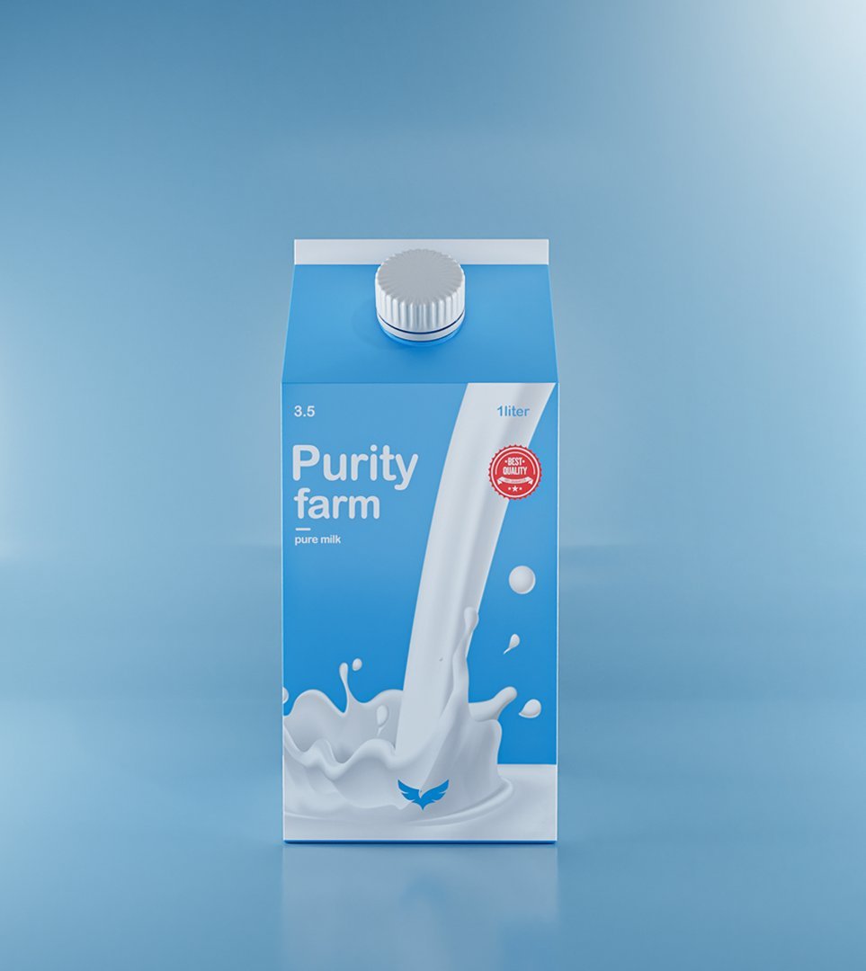
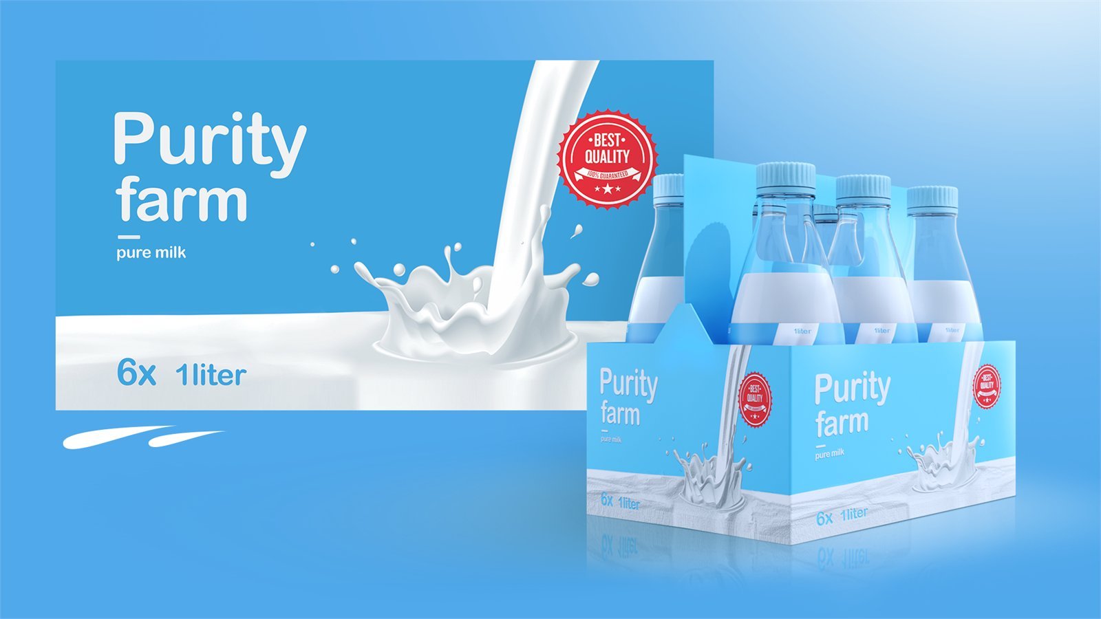
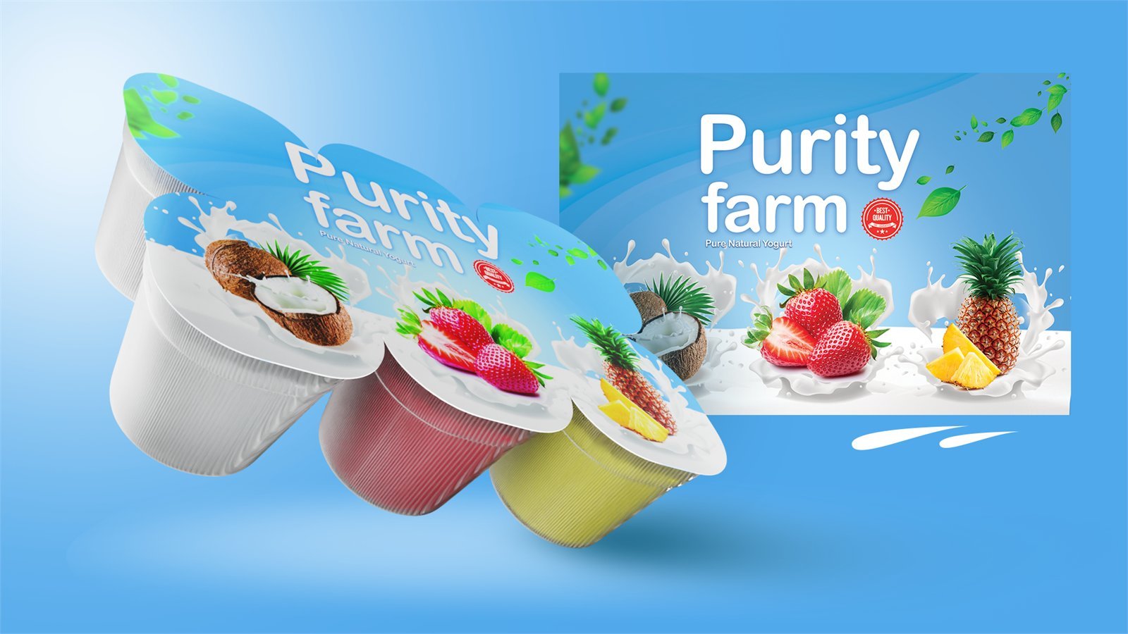
Purity Farm is a dairy company in Sudan with a full range to bring to market — fresh milk in a bottle and a carton, a multipack, and fruit yogurts. Each product sits in a different format, on a different shelf, in front of a different buyer.
Designed one at a time, a range like that turns into a family of strangers. The brief was the opposite: a shopper who knows one Purity Farm product should recognise all of them — at a glance, from across the shop.
Design fundamentals
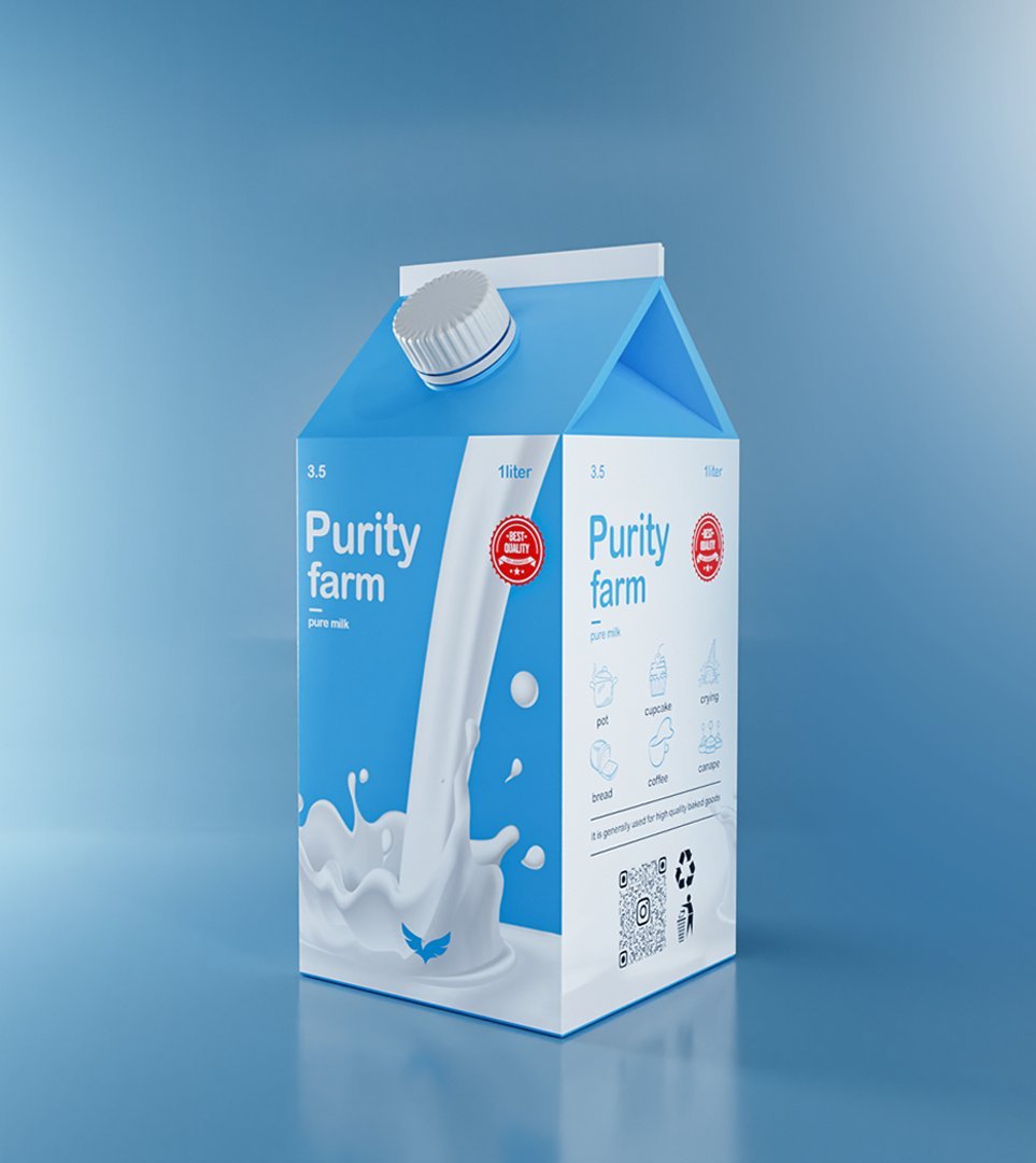
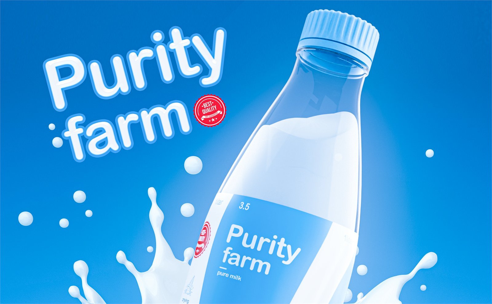
Colour that means fresh. A clean sky-blue field with white milk running through it — the two colours a shopper already reads as cold, pure dairy, owned so consistently that blue becomes Purity Farm.
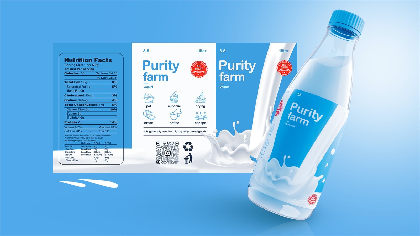
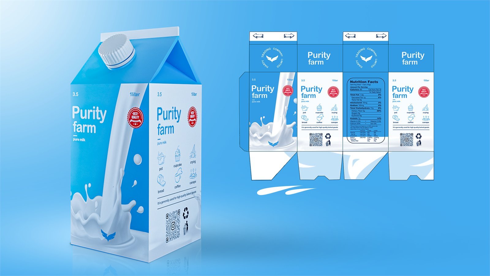
A clear hierarchy. Every front face says three things, in the same order: the wordmark, the product, and the red quality seal. Nutrition, usage icons, barcodes and QR codes move to the back and side panels, so the front never has to compete with itself.
One visual idea. A single pour of milk drives the whole range. On the bottle it fills the label; on the carton it becomes the front-face illustration; on the yogurt cup it becomes the bed the fruit sits in.
Keeping the structure
The real work of a range is discipline. We fixed one packaging architecture — wordmark position, colour field, seal, and the split between front and back — and held it on every format, whatever its shape. Only the product, the flavour colour and the fruit change from one pack to the next.
The structures themselves were respected too. Every artwork was drawn on the real dieline — the bottle wrap, the gable-top, the carrier, the cup — to the converter’s tolerances, so nothing breaks at a fold, a seam or a curve. New flavours and sizes drop into the same structure without a redesign.
Result
A dairy range that reads as one brand on the shelf. We modelled and rendered every product in 3D before production, so Purity Farm approved the full range as one shelf set before anything went to print — and the files we released were production-ready, not mockups.