Personal care · 2024–present
Active Plus
One name running two registers — a supermarket aisle and a salon back bar.
One name,
two registers.
Challenge
Active Plus sells into two rooms at once. A shopper choosing a body wash in a supermarket aisle and a technician reaching for a 3.78 litre jug of callus remover want opposite things from a label: one wants appetite, the other wants to find the right bottle fast in a back bar where every bottle is white.
A single label system would have to fail one of them. Fourteen separate ones would stop being a brand.
Approach
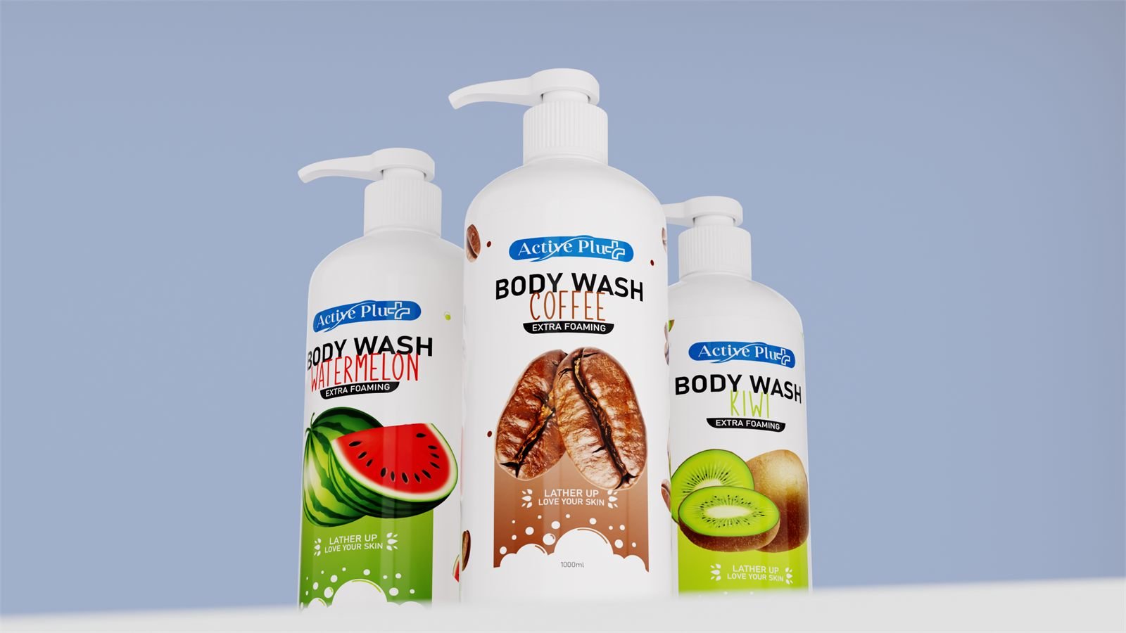
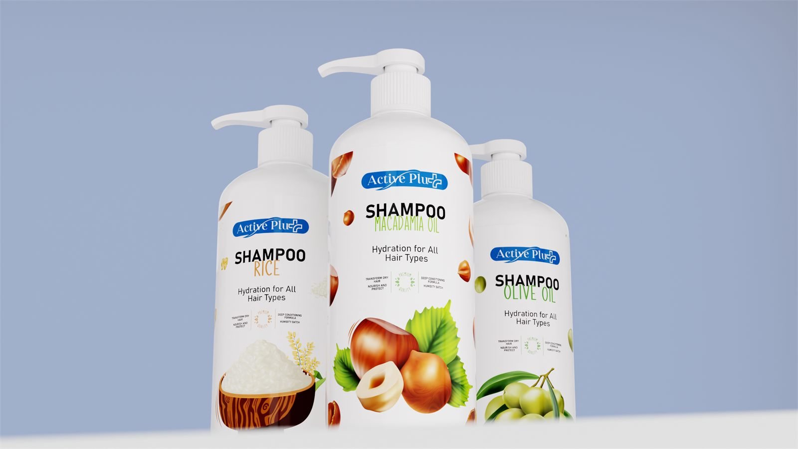
We split it into two registers under one name, with a hard rule about which is which. Retail carries the blue lozenge at the shoulder, the product name in heavy black caps, the variant beneath it in a colour keyed to its ingredient, and one oversized ingredient graphic filling the lower half of the panel.
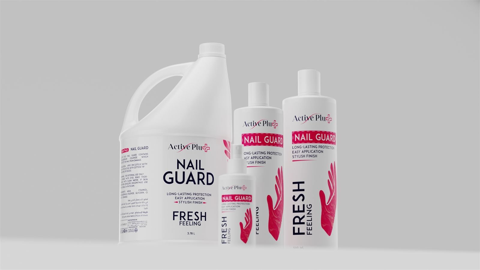
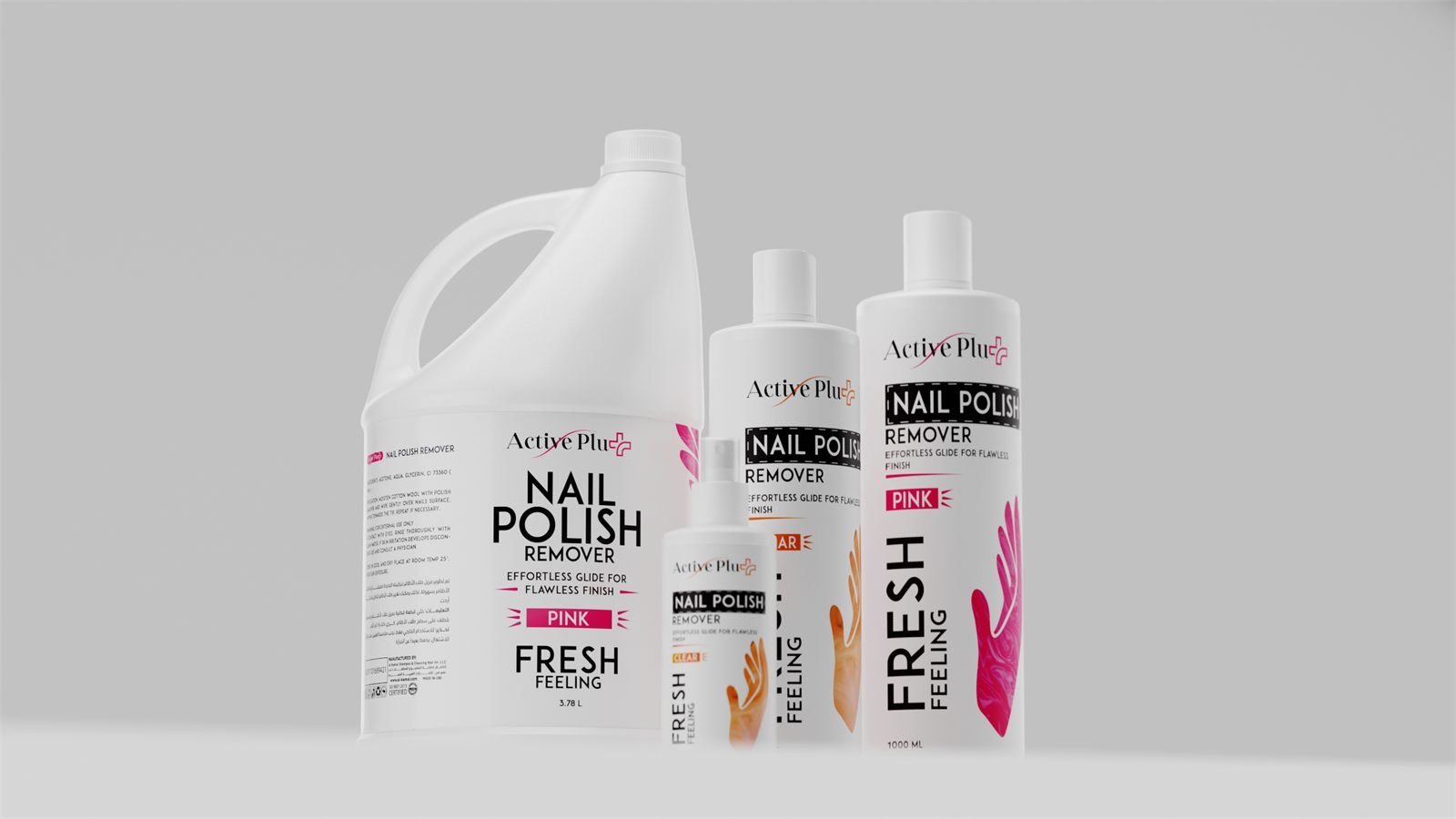
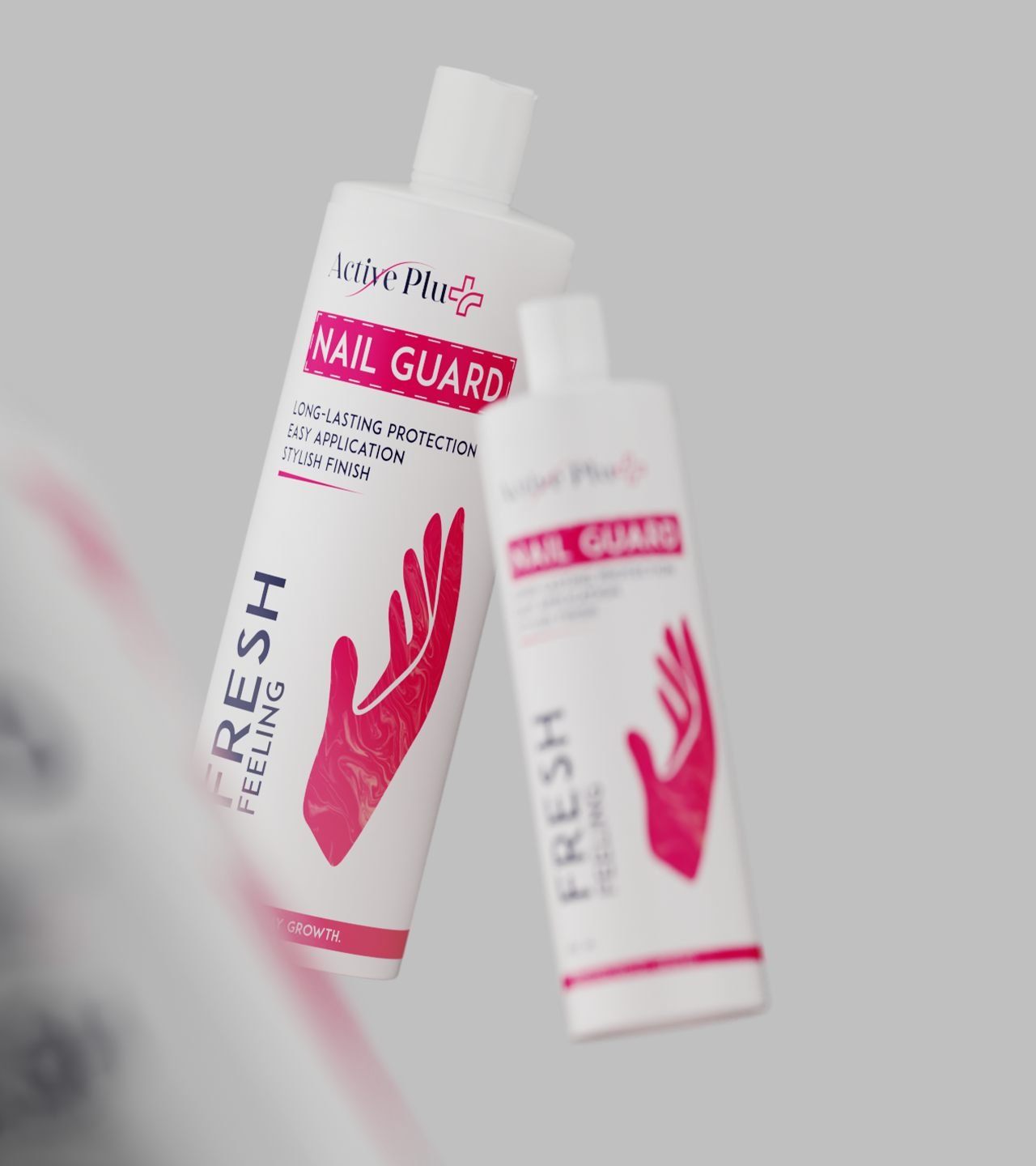
Salon drops the lozenge entirely. The wordmark becomes a thin black swash, the product name sits in a dashed banner, and FRESH FEELING runs up the side in type big enough to read from a trolley. There is no ingredient photography at all — just a marbled hand or foot in one colour, which is the only thing that changes between variants.
Process
We drew the salon artwork at the jug first and scaled it down, not the other way round. A 3.78 L jerry can gives the label the least type height relative to its panel of anything in the range; a layout that survives there survives on a 125 ml spray, and the four sizes stay recognisably the same pack.
Retail runs the opposite way — the graphic is drawn to fill, so a new variant is a colour and an illustration rather than a redraw. Arabic sits alongside English at equal weight on the lines that carry it.
Result
Fourteen lines that read as one brand from the end of an aisle and as two different products in the hand, which is exactly the distinction the buyer is making. We rendered the whole range as a shelf set before print, so it could be signed off together rather than one label at a time.
Our packaging redesign for Al Kamal Shampoo has contributed to over AED 4 million in monthly sales. Across the company’s brands we have produced 3D visuals for more than 200 product containers, with one design team keeping them consistent.
The retail aisle
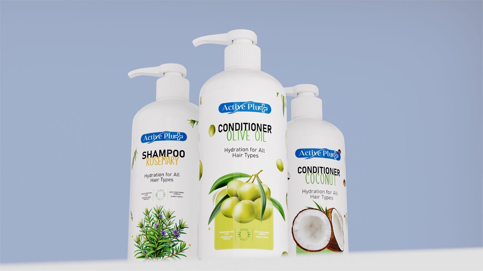
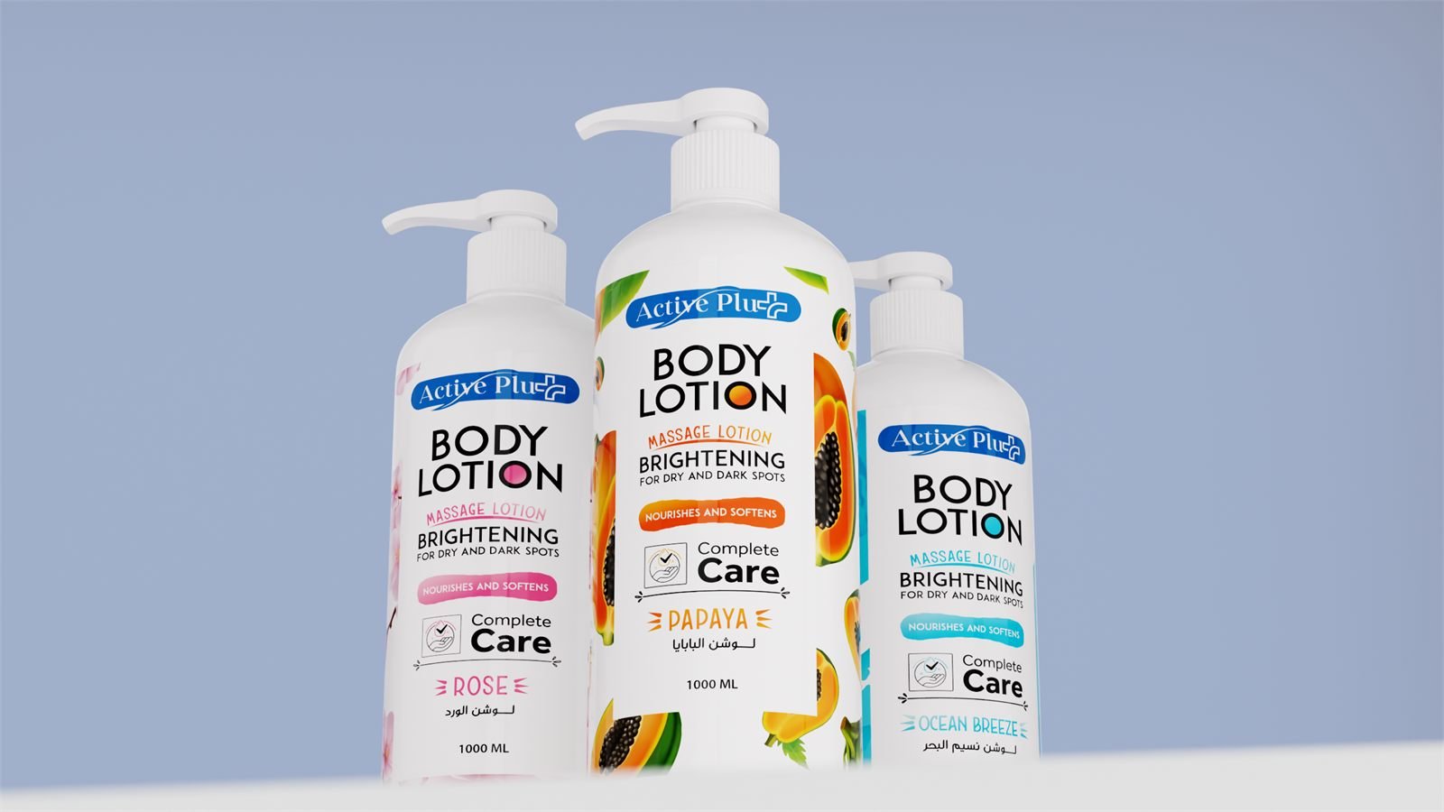
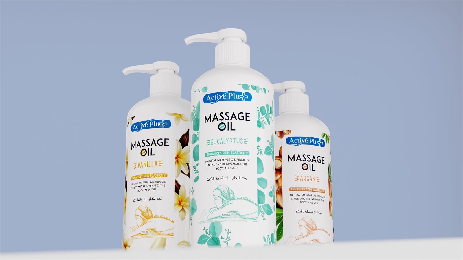
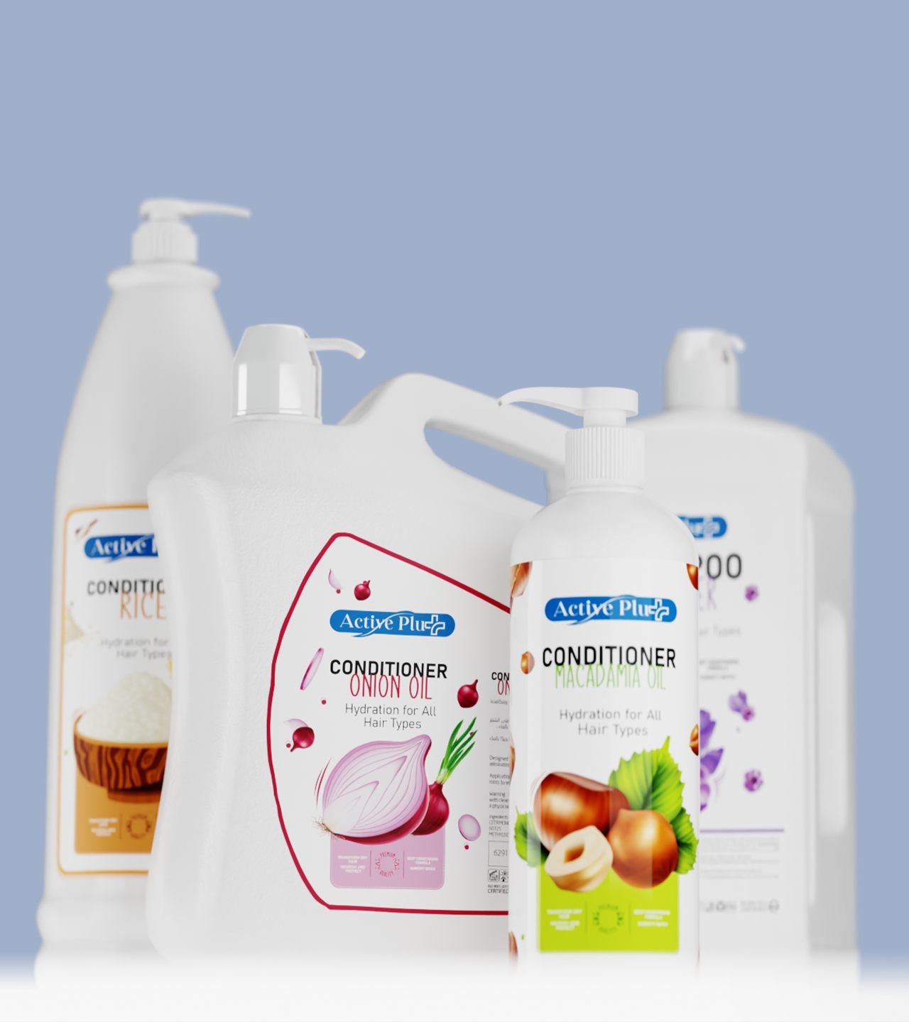
One line, four formats
The conditioner alone runs from a 500 ml pump to a salon jug. The artwork is drawn once and the panel changes shape around it — wordmark at the shoulder, product name under it, ingredient graphic filling whatever is left.
Nothing is re-laid for a new size. The graphic is the only element that flexes, and it is the one element with no information in it.
Scrubs and gels
The tub is the format
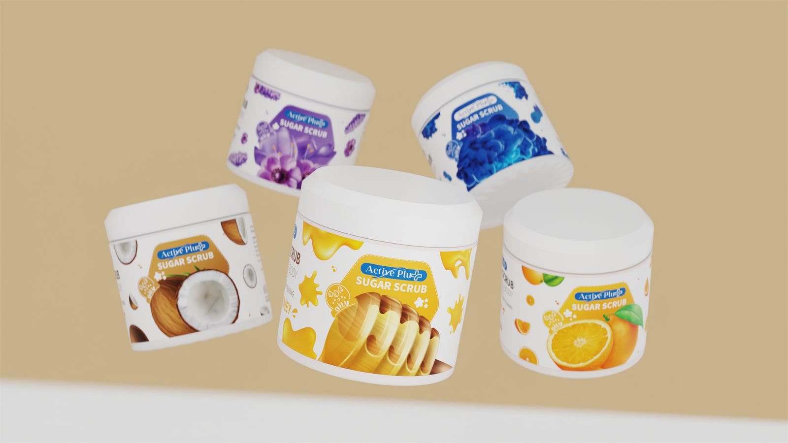
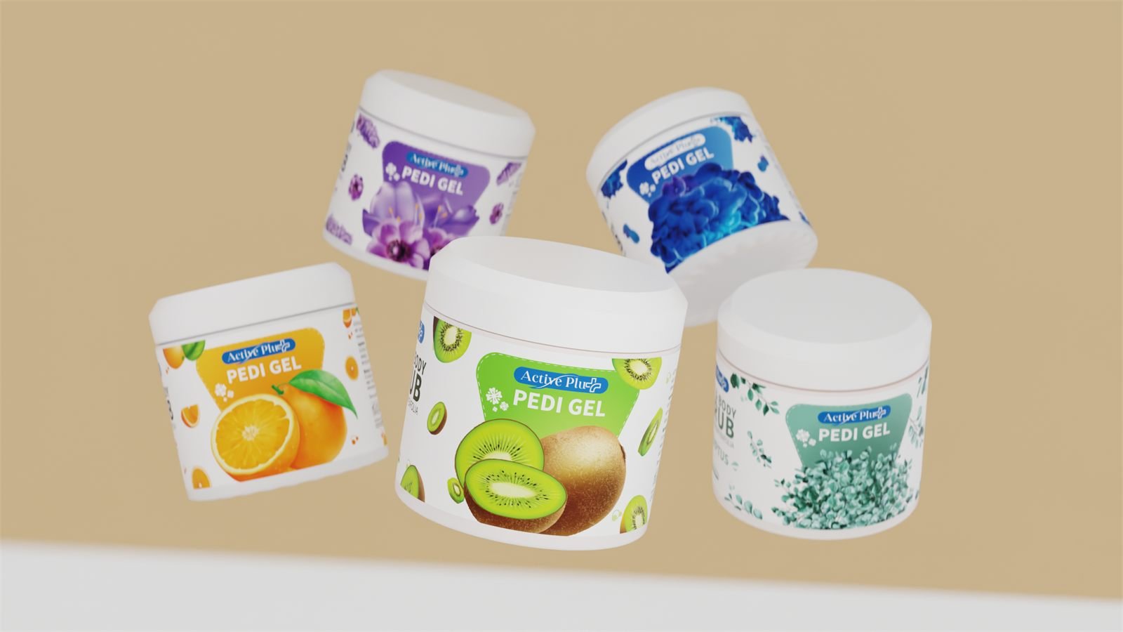
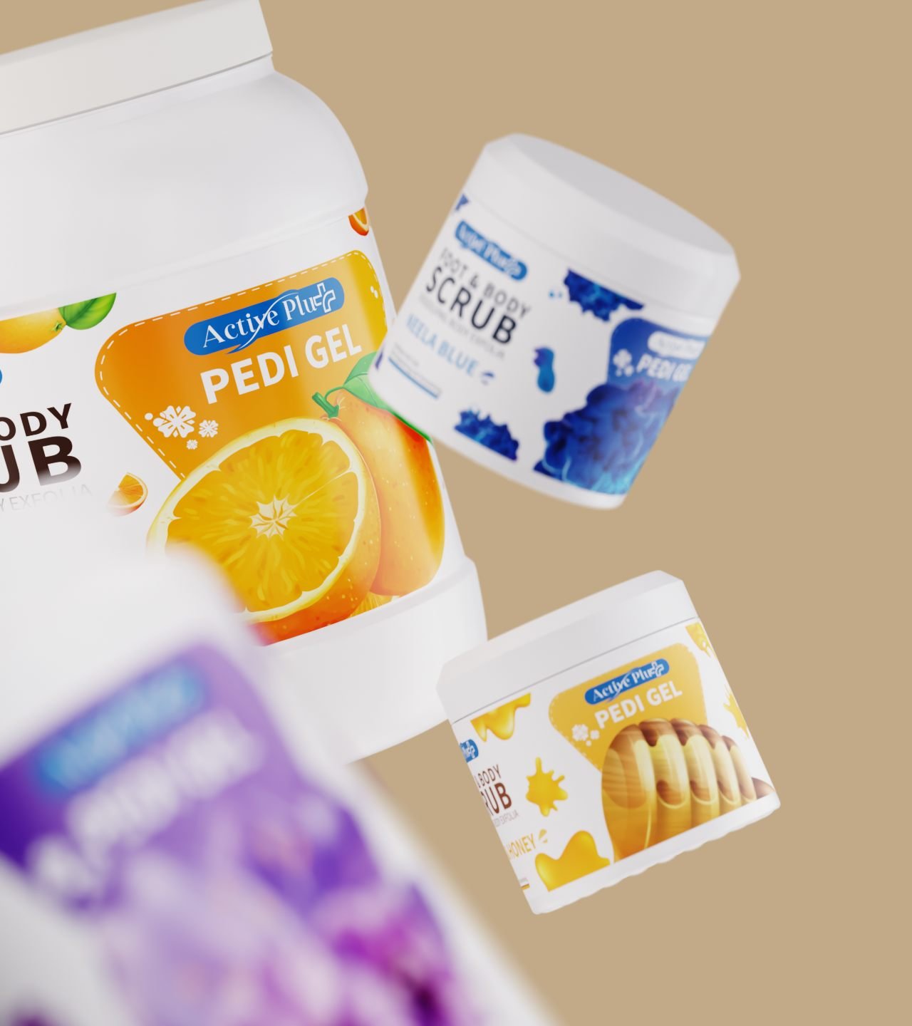
Scrub, pedi gel and foot soak share one tub and one label shape. Only the band across the front changes — its colour, its wording and the fruit or flower behind it.
It is the cheapest kind of range extension there is: a new variant costs one band, and the tooling never moves.
Flavour is the only variable
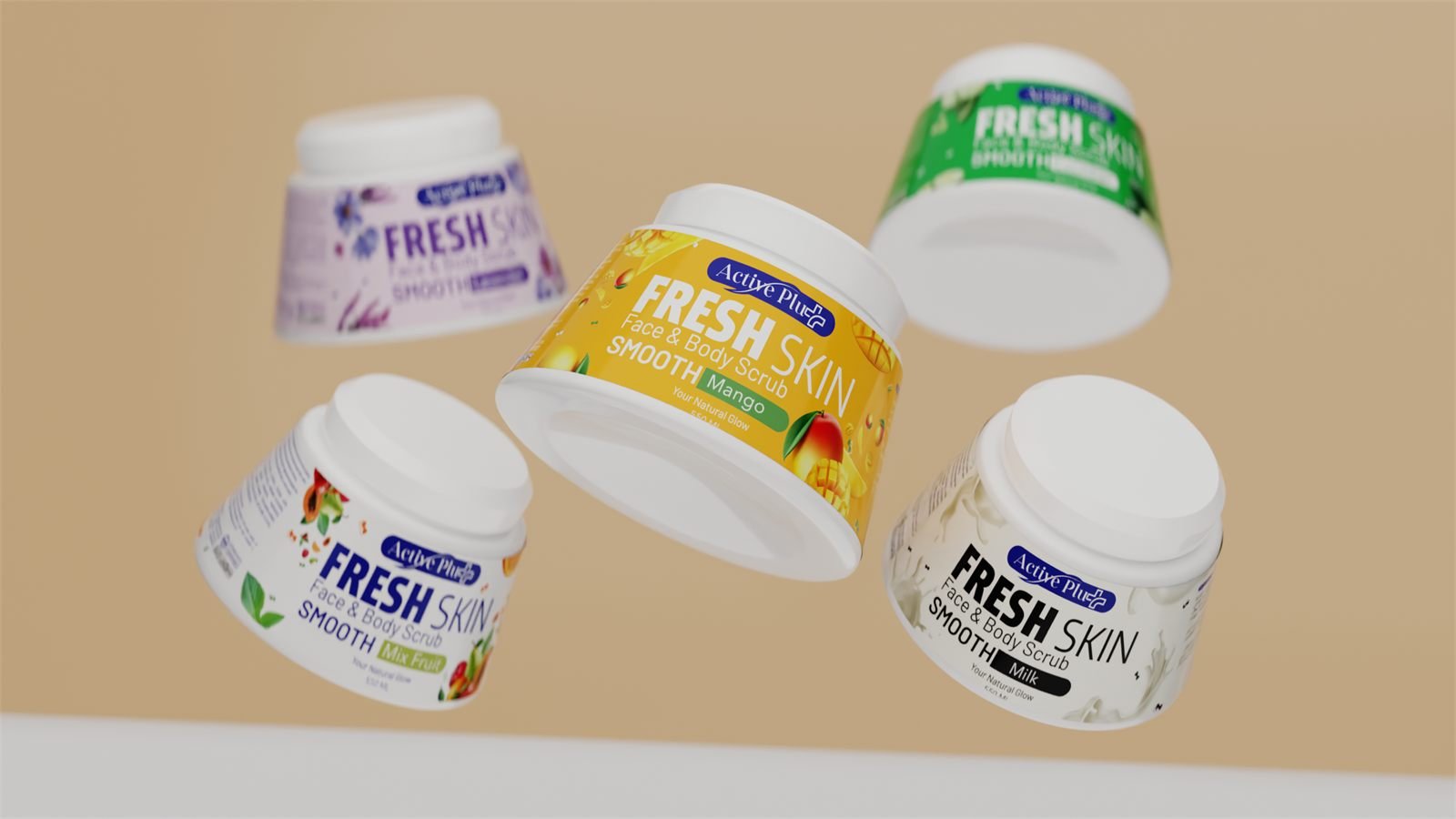
Fresh Skin runs five flavours through an identical layout. The band takes the flavour colour, the name sits in it, and the rest of the tub is left white.
Lined up on a shelf they read as one product in five colours, which is how a scrub is actually bought.
The serums
Hair serum stays retail
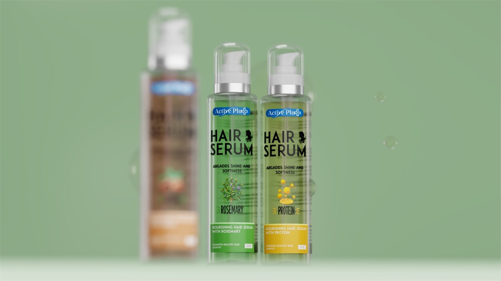
The hair serums keep the blue lozenge and the ingredient colour, because they are bought beside the shampoo and the conditioner — same aisle, same decision, so the same rules apply.
The tube is clear rather than opaque, so rosemary green and protein amber come from the liquid itself. The colour on the pack is the product, not a print of it.
Face serum steps away
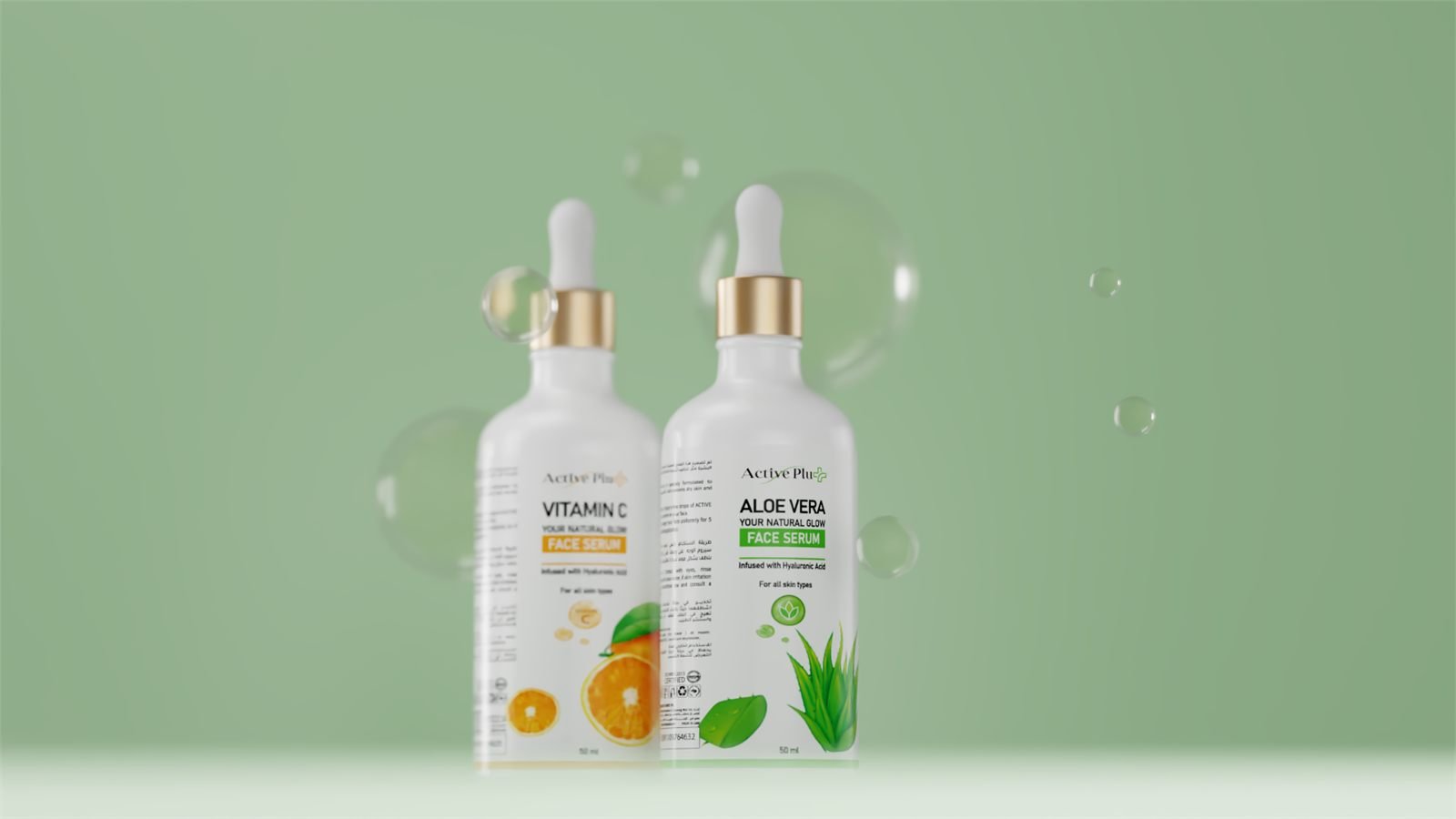
The face serums drop the lozenge entirely. Glass, a gold collar, the wordmark in the thin swash, and a single botanical at the base — none of which appears anywhere else in the range.
At 50 ml this is the smallest and dearest thing Active Plus makes, and the pack is built to be believed rather than to shout.
Two actives, one bottle
Aloe vera and vitamin C are the same bottle, the same collar and the same type. The green and the amber come from the liquid and from one panel of colour, nothing else.
The only printed difference is the active’s name — which is the one thing a serum buyer is actually comparing.
The salon back bar
Drawn at the jug
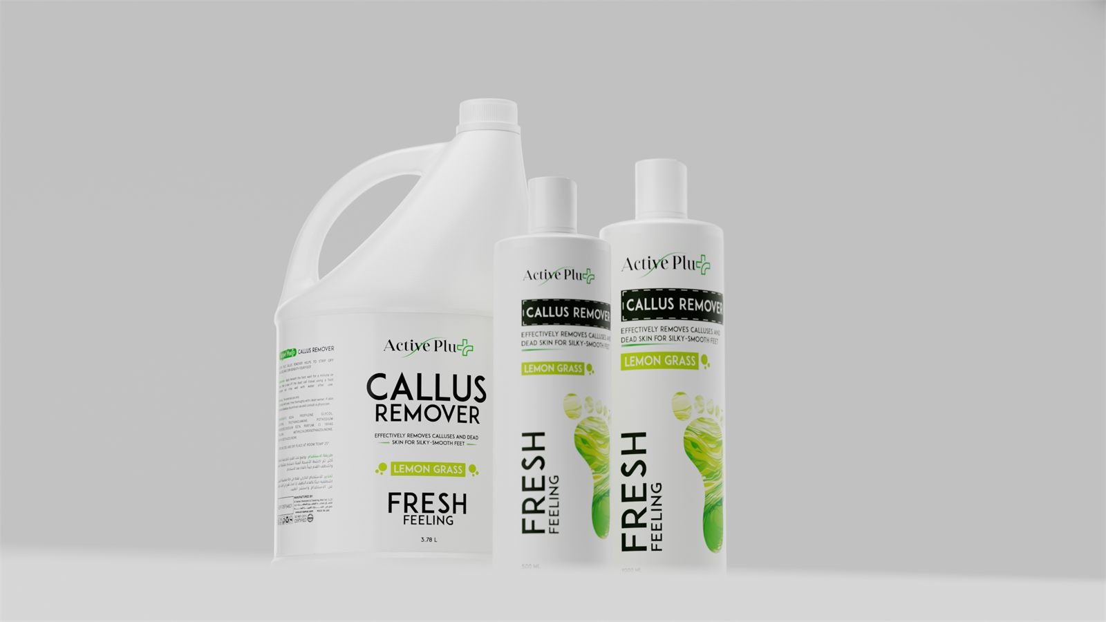
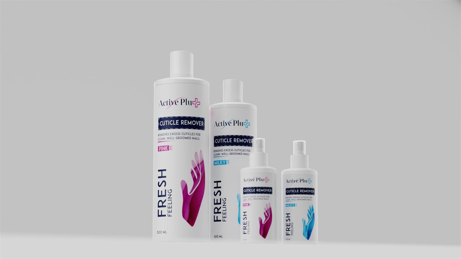
The salon artwork was set at the 3.78 L jerry can first and scaled down. That pack gives the label the least type height relative to its panel of anything in the range.
A layout that survives there survives on a 125 ml spray, and the four sizes stay recognisably the same pack on the same shelf.