Sun care · face & body
Jardin Flamingo
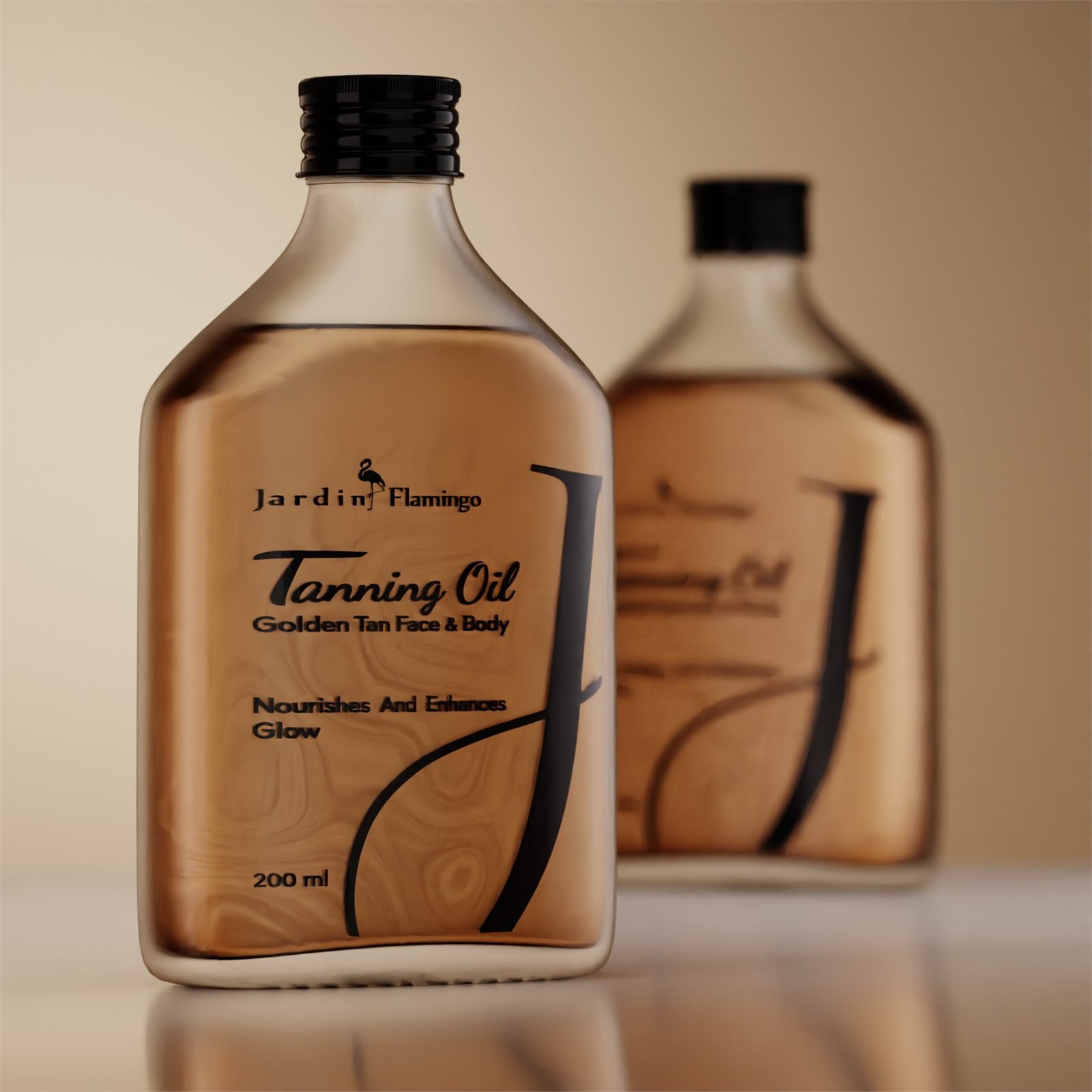
A premium tanning oil with a signature touch — elegant glass that lets the product supply the colour.
Premium by
design.
The brief
Jardin Flamingo is one of the best-known cosmetics brands in the UAE, produced by one of the largest cosmetics factories in Sharjah. For its new tanning oil the brand asked for a product with a signature touch, in a premium bottle, with an elegant design — a pack that stands apart on any sun-care shelf.
Challenge
A tanning oil is bought on a promise about colour. Almost every pack in the category prints that promise — a gradient, a sunset, a photograph of skin. The result is a shelf where every bottle makes the same claim in the same way, and none of them looks premium doing it.
Approach
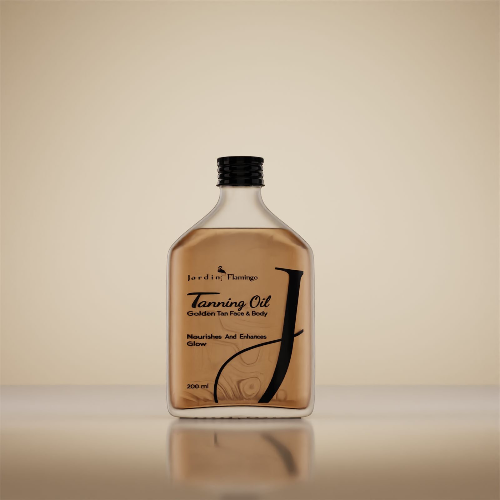
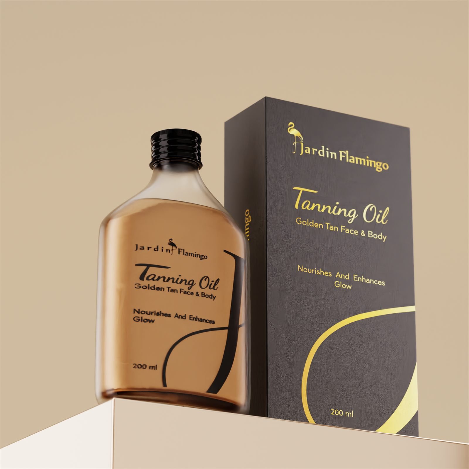
We left the glass clear and let the oil be the colour. The label is black line art and nothing else, so the amber reads straight through it and the fill level becomes part of the design.
Nothing on the front is printed in the colour it is selling. The buyer is looking at the product, not at a picture of what the product is supposed to do.
Process
A flat flask rather than a round bottle: it presents a full front face on shelf, stacks without rolling, and gives the 200 ml fill a depth of colour a cylinder of the same volume would thin out.
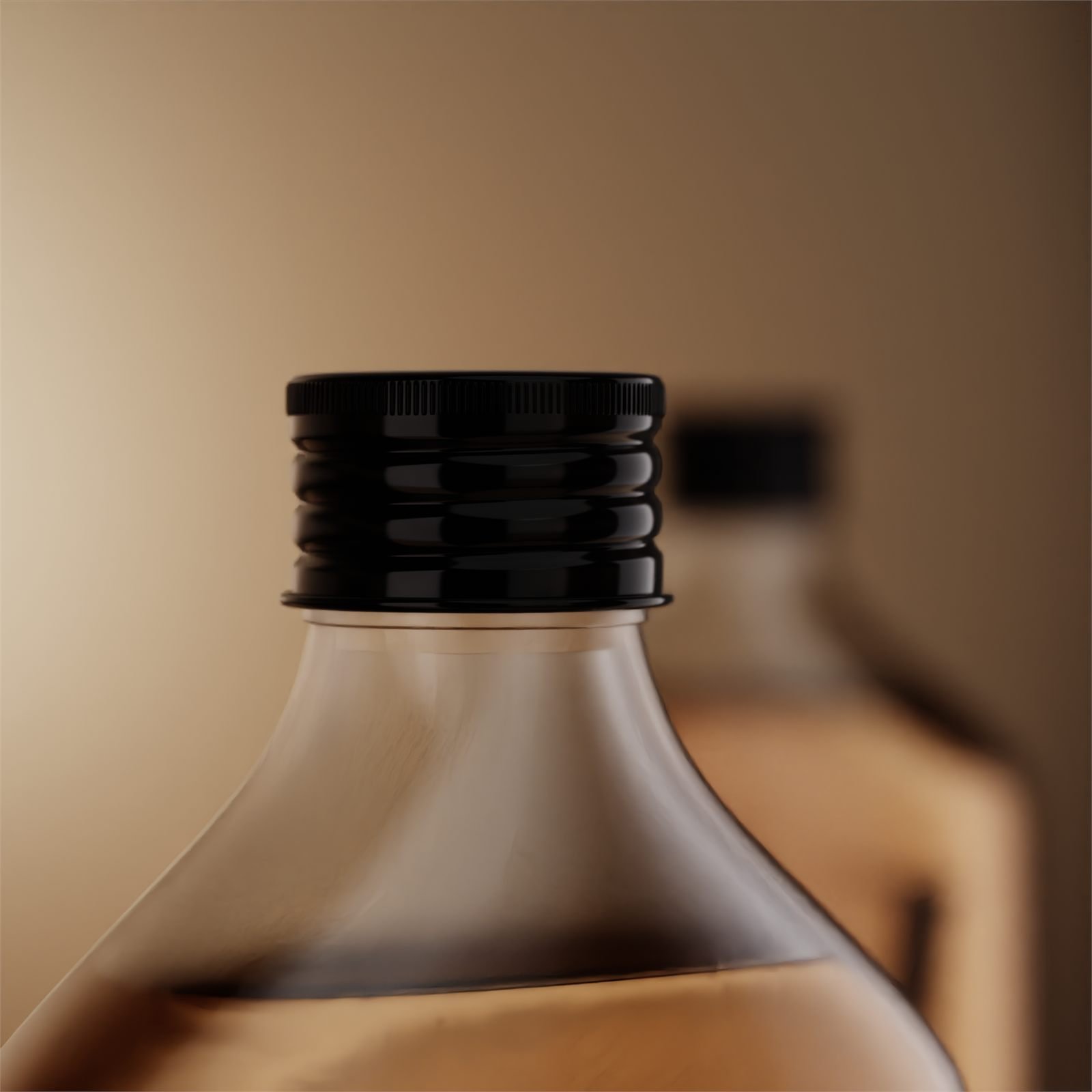
The closure is a ribbed black screw cap, the one solid black mass on the pack, which anchors a design that is otherwise entirely line work. Type is kept to two voices — a script for the product name, a plain sans for everything that has to be read rather than felt.
Result
A tanning oil that looks as premium as it feels — and gives Jardin Flamingo a signature piece in its range. The pack has nothing that can fade, because its colour is its contents. It photographs in daylight without styling, and the gold-foiled carton carries the brand in the one place the bottle cannot — closed, on a shelf, before anyone has seen the oil at all.
Drawn to the bottle
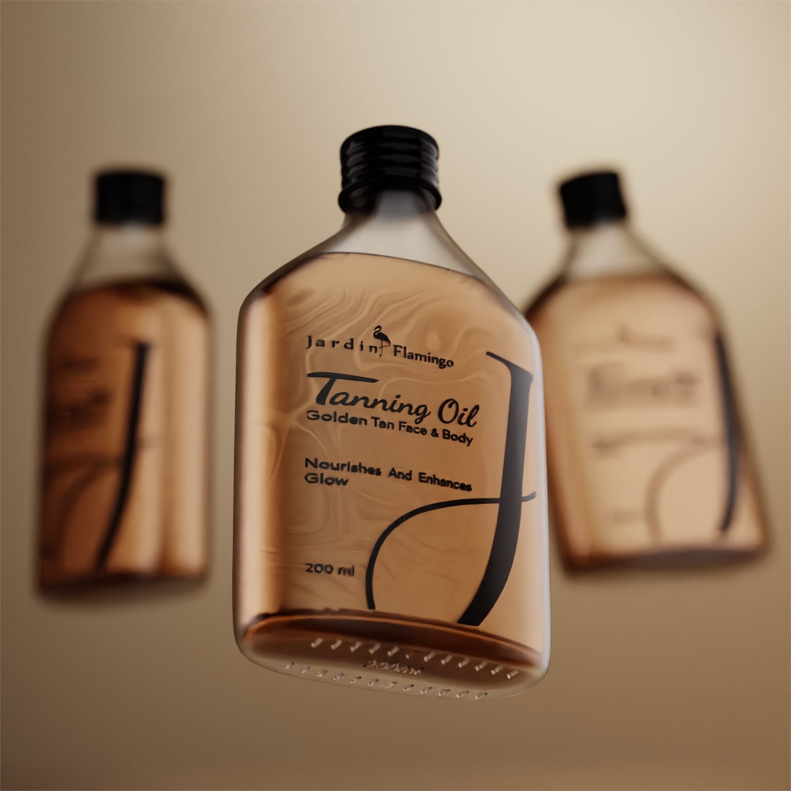
The J is not placed on the flask, it is drawn to it. Its tail picks up the shoulder radius and resolves into the bottom corner, so the curve belongs to the glass rather than sitting on top of it.
It is the only element allowed to break the text block, and it runs nearly the full height of the panel — which is what makes a 200 ml bottle read as tall.
The carton inverts it
The bottle has no colour of its own and the carton has nothing else. Charcoal board, gold foil, the same flamingo and the same script — one identity run in negative.
It is a deliberate swap of jobs. Boxed, the carton sells the product; unboxed, the product sells itself, and the buyer never sees the two make the same argument twice.