Automotive lubricants
Hi-Lube 10000
A motor oil that stays quiet on a shelf built for shouting.
Black, and
two colours.
Challenge
The motor oil aisle is a shouting match. Every jug on it is red, silver or electric blue, carrying flames, chrome and a horsepower figure. Hi-Lube had to read as the premium option in a category where premium normally just means louder.
Approach
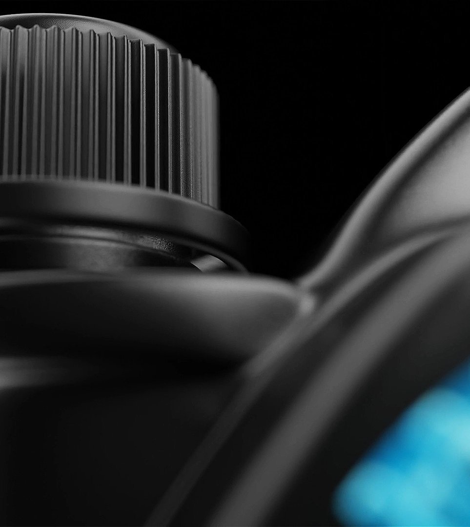
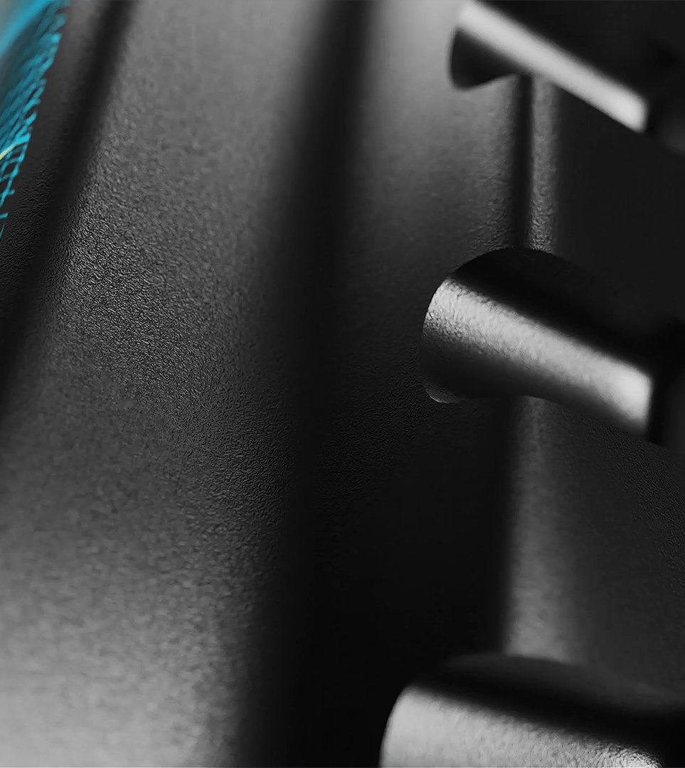
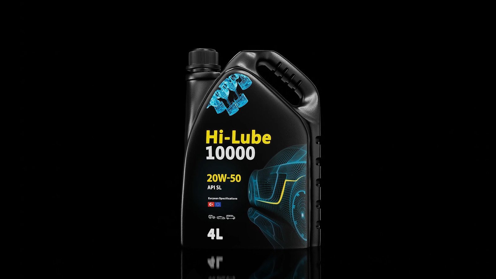
So the pack went black — the body, the cap, the handle and the grain, all one black. Colour appears exactly twice: a yellow oil drop holding a cyan falcon, and a cyan wireframe car running off the right edge of the face.
Everything else on the front is information a buyer actually needs at the shelf and nothing more — the grade, the API rating, the European specification marks, the three vehicle icons and the volume.
Process
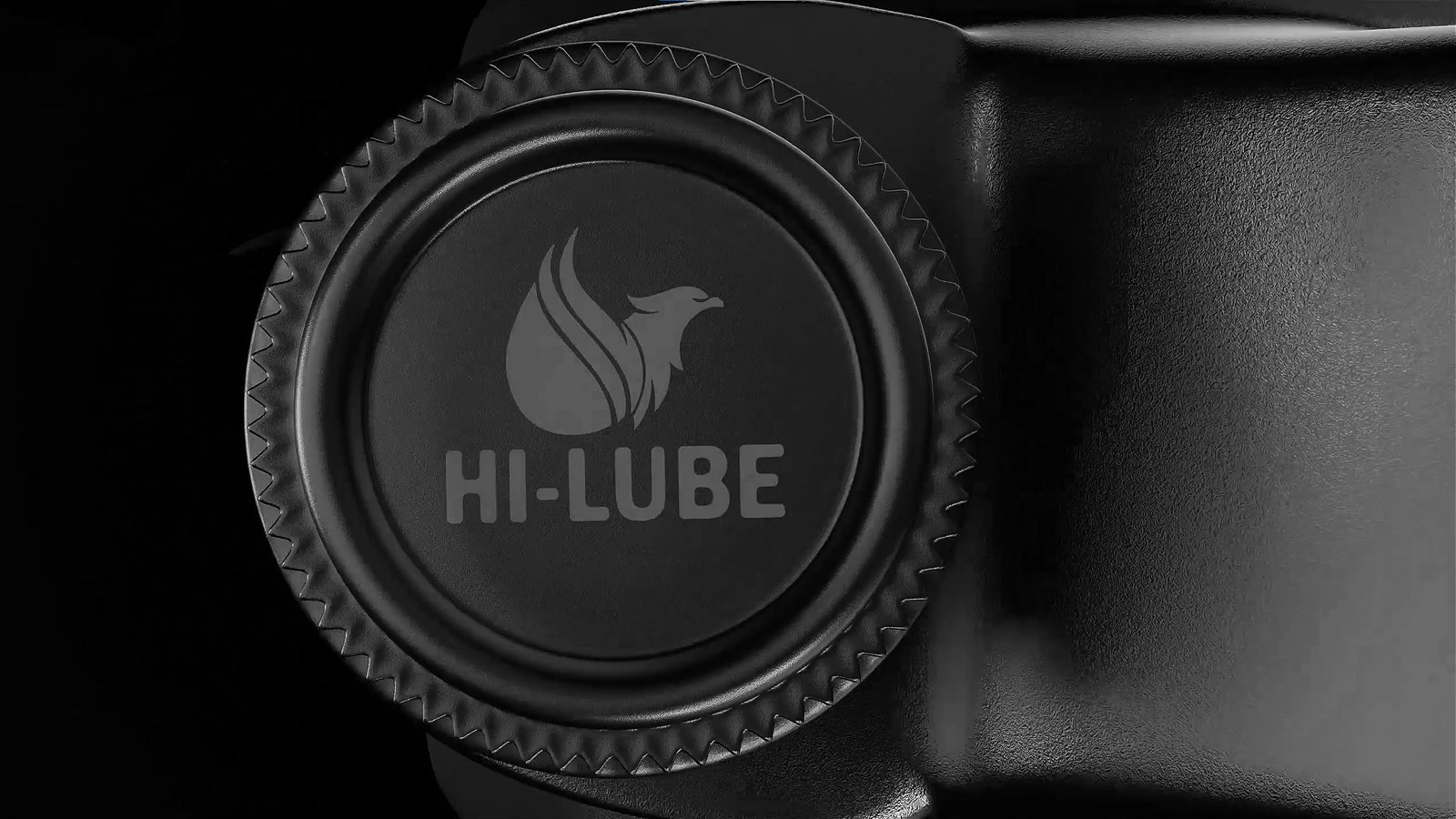
The mark is tooled into the cap, not printed on it, so the brand survives a workshop floor — which is where this pack spends its life, and where a printed cap stops being legible within a week.
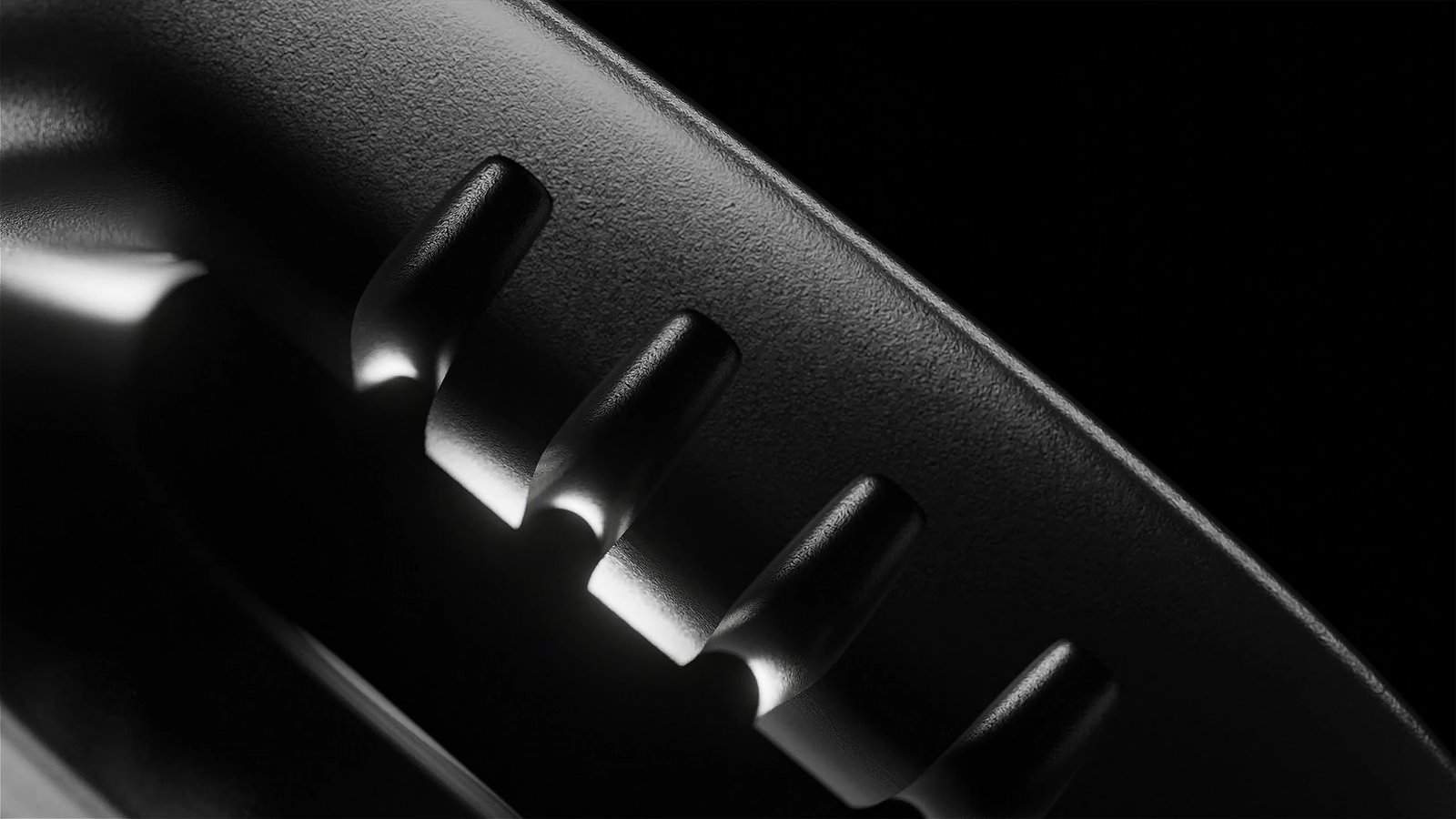
Cap knurling, handle ribs and the neck were modelled and rendered as macro studies before tooling, so the parts that carry the brand were signed off as structure rather than as artwork laid over a stock bottle.